
R O C K F O R D W O M A N M A G A Z I N E C O V E R S
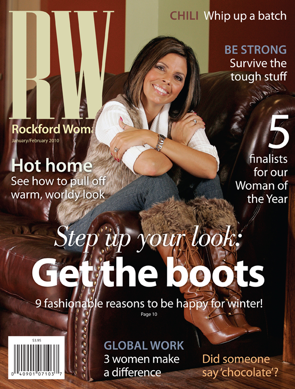
This was the first cover after we redesigned the magazine for the first issue of 2010. We incorporated more variations in the font sizes and we added Bodoni Std book italic to help add interest to the typography.
|
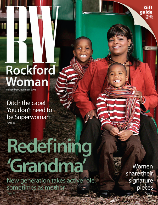
This was an earlier cover from November/December 2008. This is one of my favorite covers. The styling, the colors and the composition really work well. The red and green just worked out so well, and no one thought, wow, it looks hot in that photo, even though it was probably in the 80s outside.
|
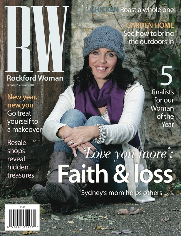
Tasha Ives, Sydney Ives mother, was our cover model for this shoot. The photographer, Amy J. Correnti, and I took her photo in front of an old stone and wood fence in a residential neighborhood. This was one of our favorite covers because Tasha was so relaxed and easy to work with, and the cover is so natural and really conveyed what the magazine was about. Real women in Rockford with real stories to tell.
|
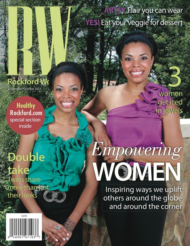
This shoot was super fun. These two young women were so easy to work with and outgoing. The challenge for this cover was fitting two people in the frame, while making sure it had that certain "pop" that one subject covers have. I think the bright colors and their natural, beautiful smiles really help achieve that.
|
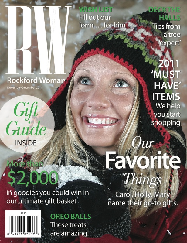
This was our November/December 2011 Gift Guide cover shoot. I threw fake snow all around her while our photographer, Amy J. Correnti, shot furiously.
|
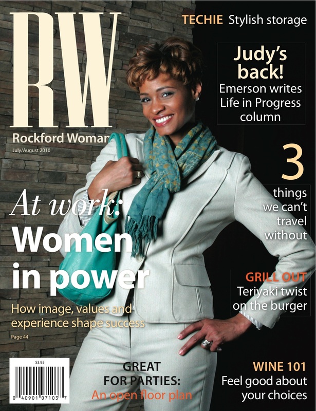
This was our July/August 2010 issue. This woman was amazing. She has her own television show, so she was a natural in front of the camera.
|
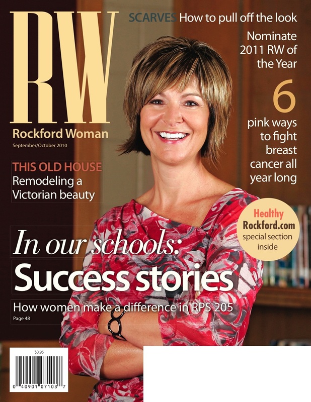
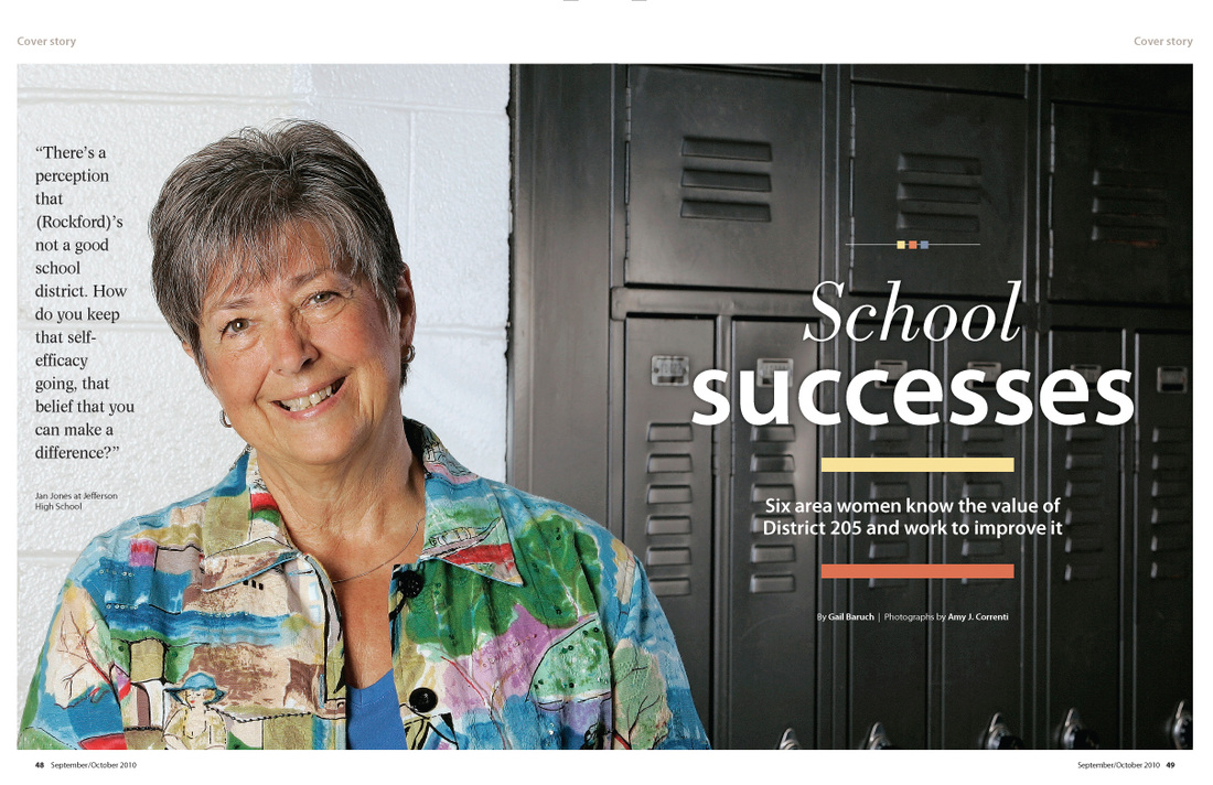
This was our September/October 2010 cover. This woman was the outgoing principal at Summerdale School. This is a good example of making something unexpected work. We actually had two versions of the cover, this one and one with her standing in front of a green chalkboard. The photographer, Amy J. Correnti, and I were sure we would go with the chalkboard version, but our editors chose this one for it's warm tones and feel.
|
P A G E L A Y O U T S
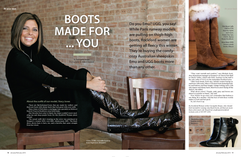
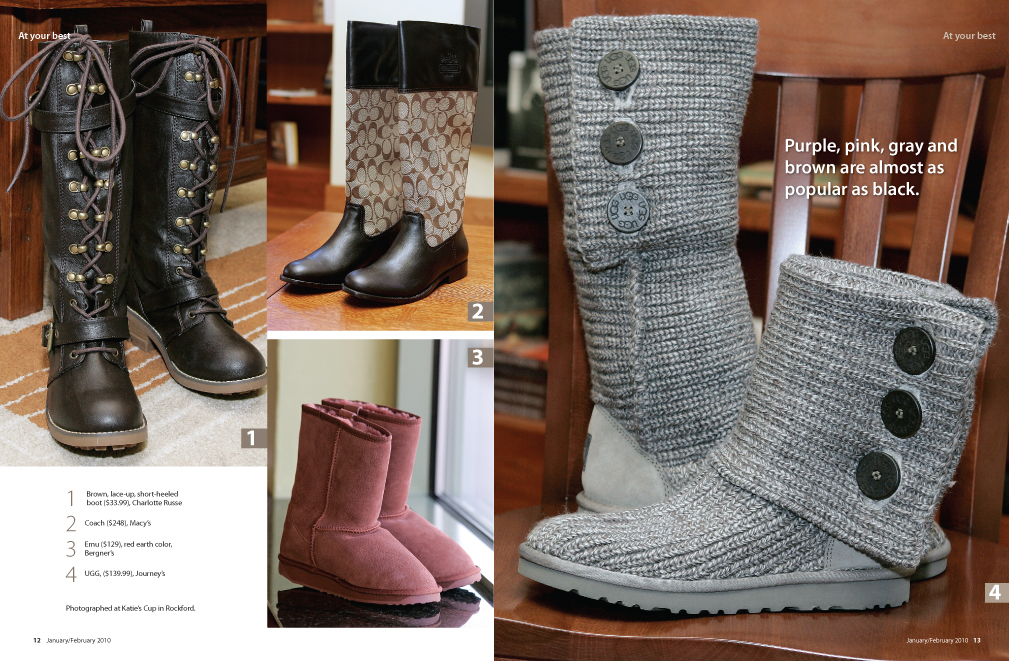
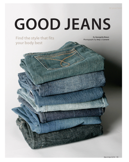
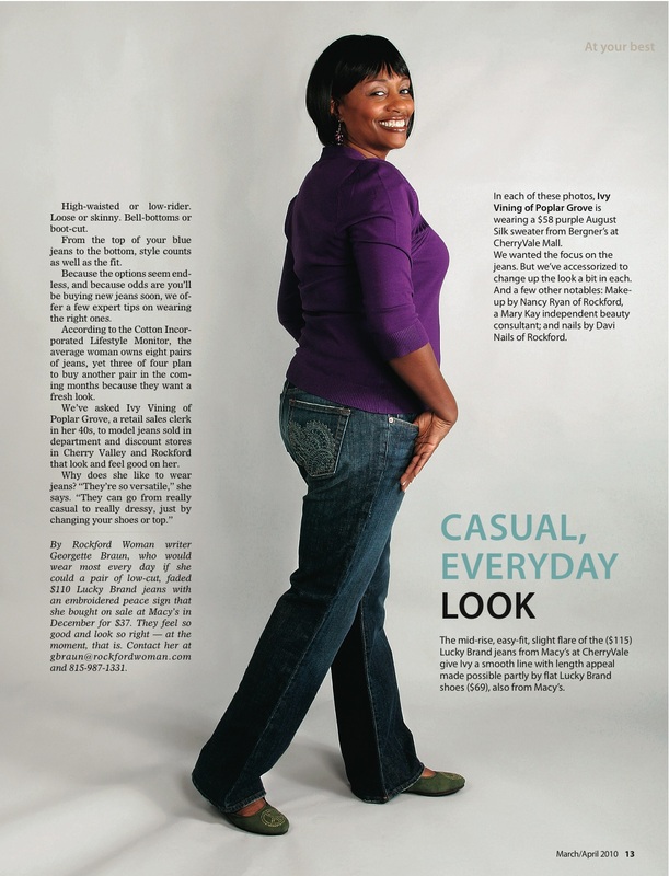
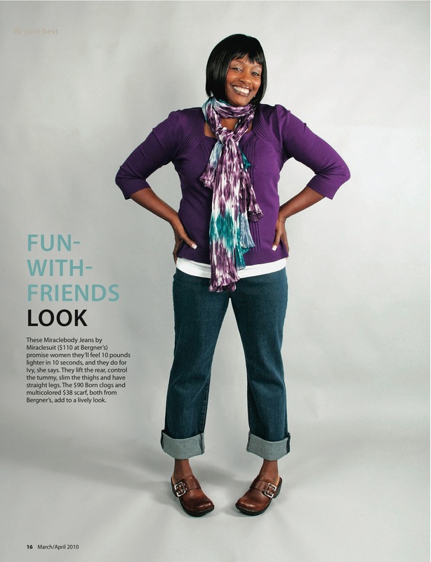
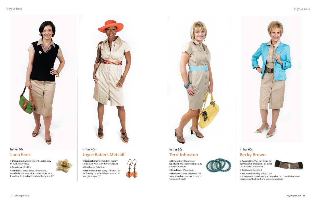
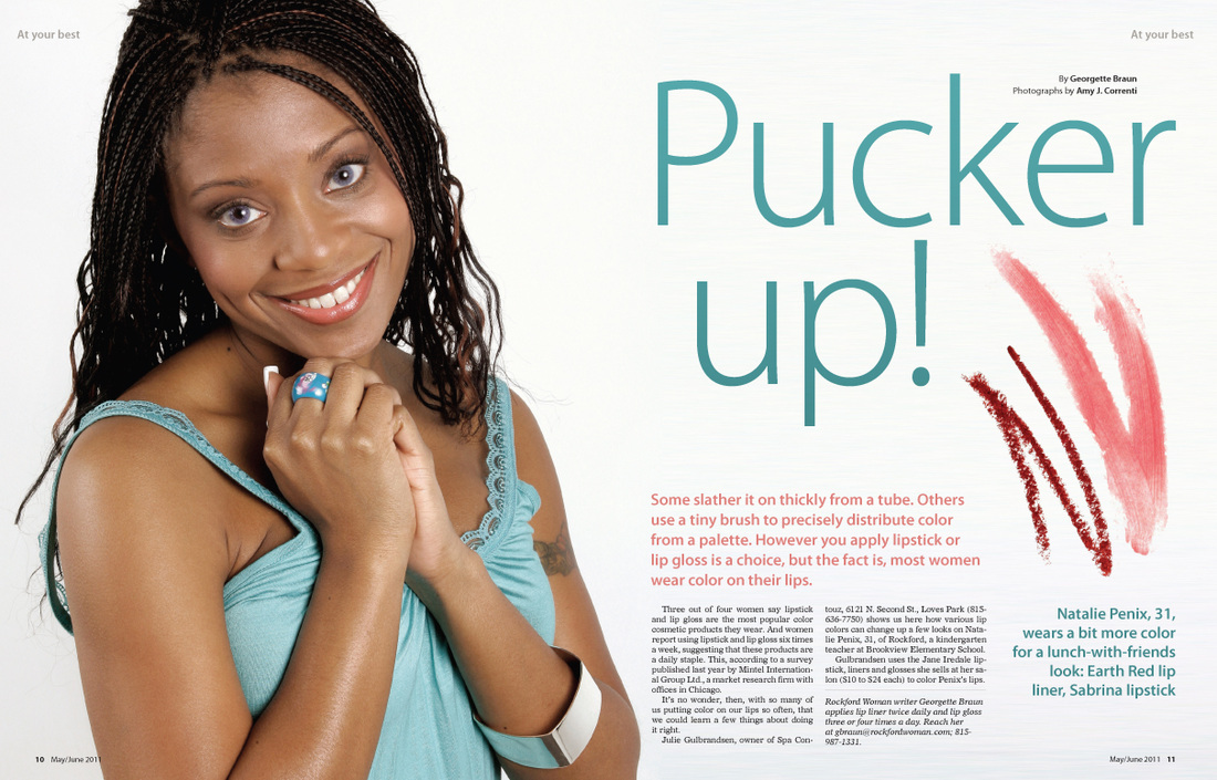
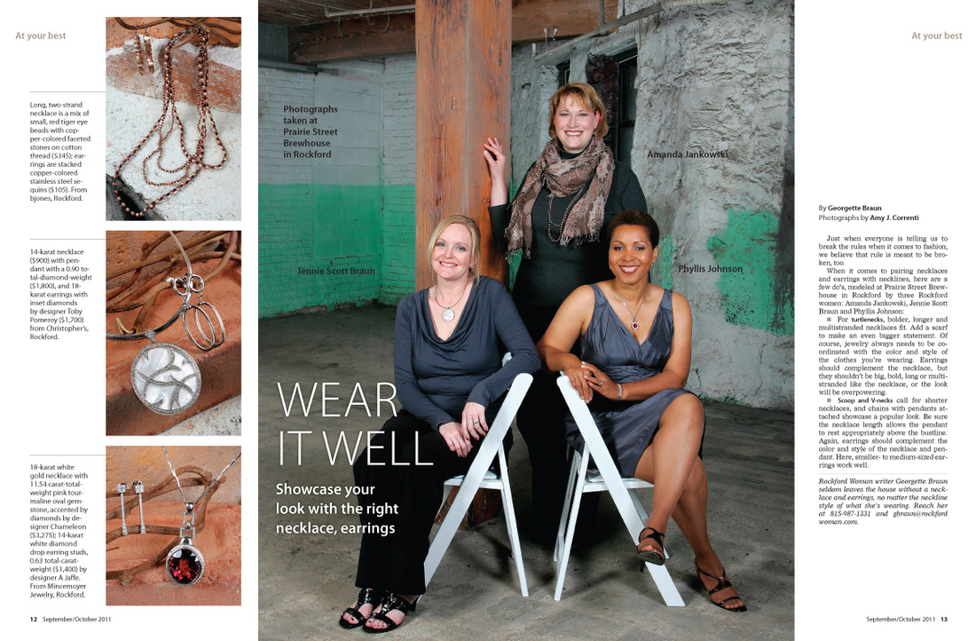
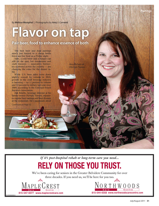
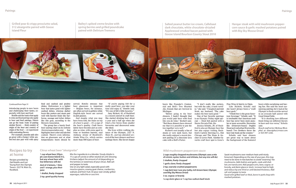
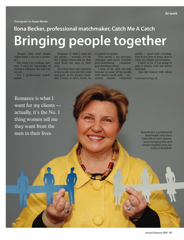
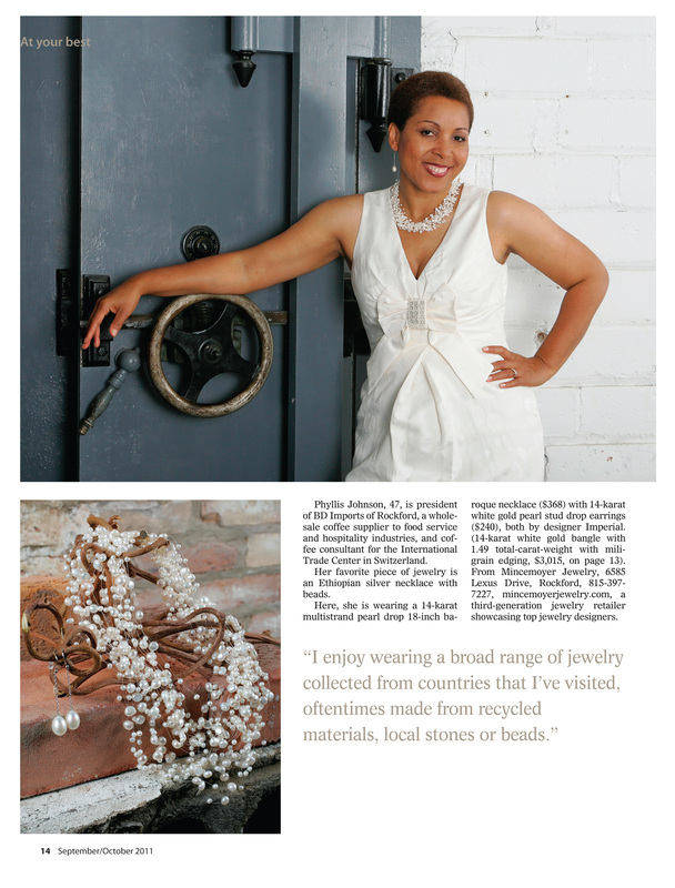
These are some layouts I created for a regular feature of the Rockford Woman magazine, titled "At your best." The photographer and I worked closely on each of these features to give each layout a distinct look and feel.
|
|
|
|
|
|
|
|
|
|
|
|
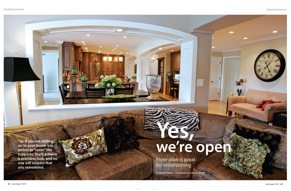
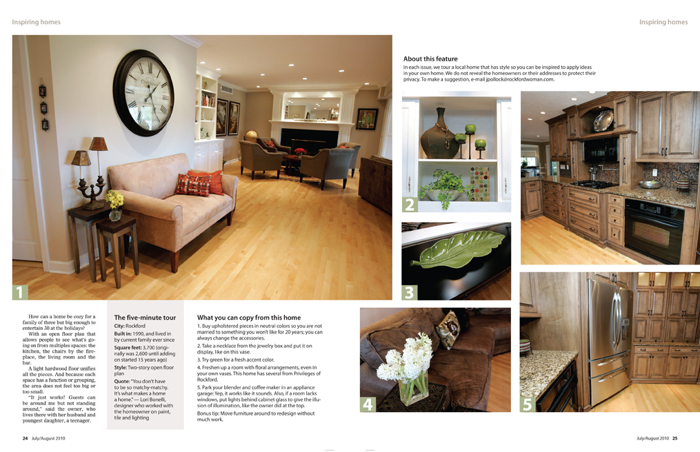
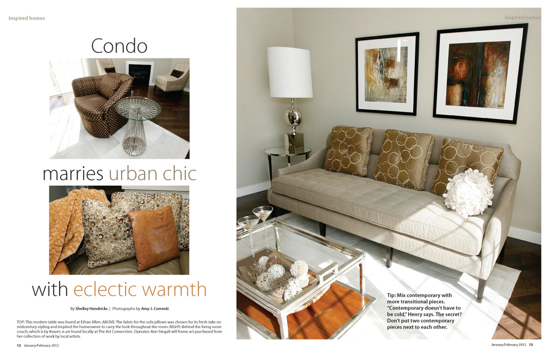
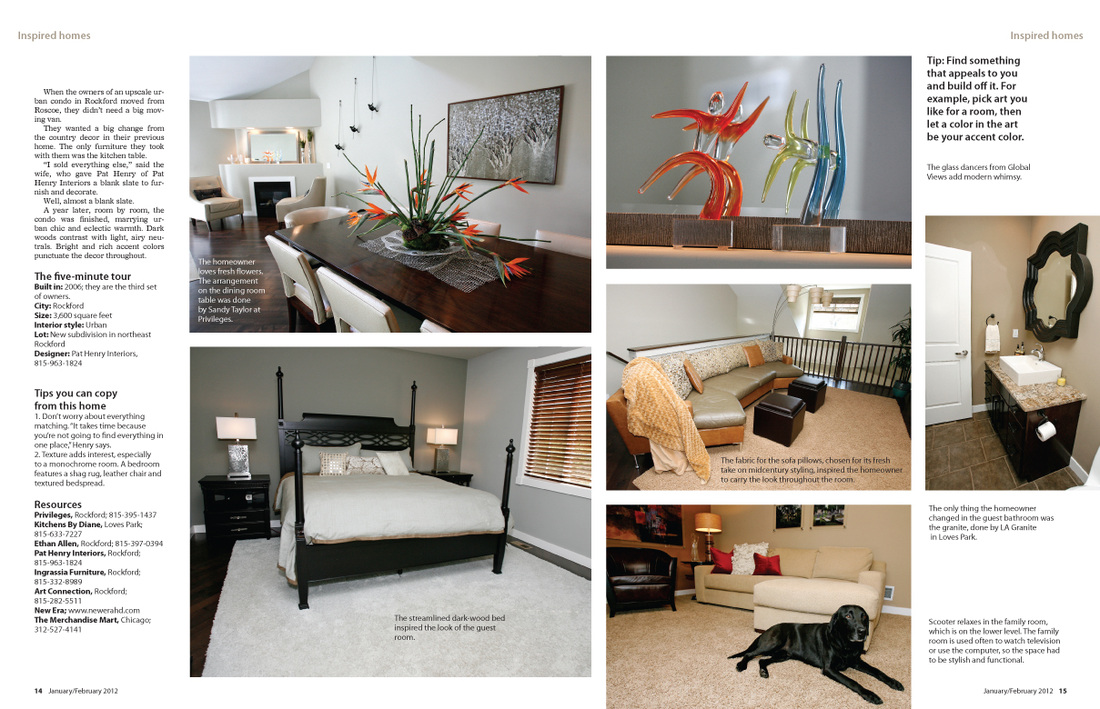
These are layouts for another regular feature, titled "Inspired homes."
|
|
|
|
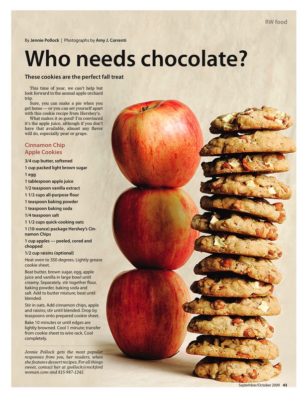
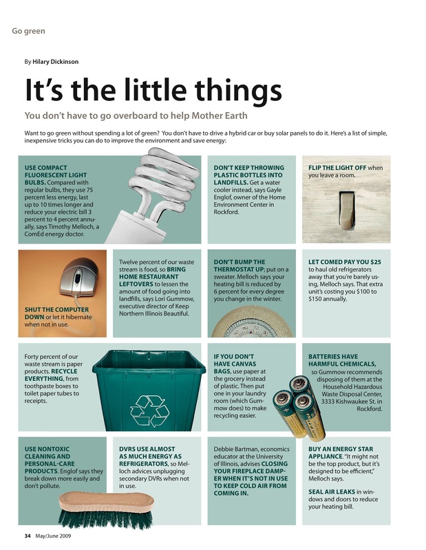
These are other layouts I designed, all published in the magazine.
|
|
|
|
|
|
|
|
|
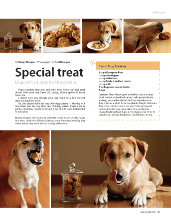
This was a recipe for carrot dog cookies that I wrote, baked and this is my dog, Becca.
|
|
I created the paper doll cutouts for this photograph.
|
This page was created completely with clipart imagery that I found.
|
S P E C I A L S E C T I O N C O V E R S A N D L A Y O U T S
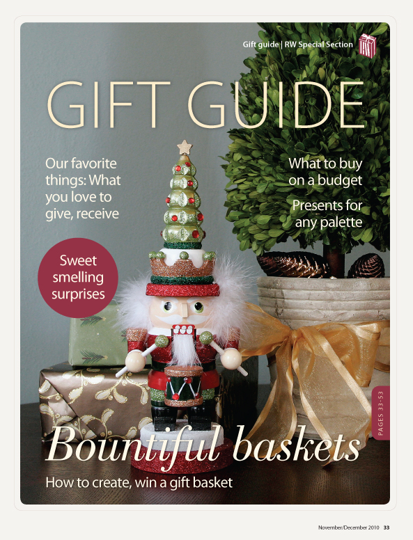
This is the 2010 Gift guide cover. I really liked how this turned out. It wasn't overly red or green, but it said Christmas and I felt like it spoke to the feeling we were trying to create: Elegant and classy decor for the modern woman. It also reflects our redesign of the magazine, with the incorporation of the Bodoni accent font.
|
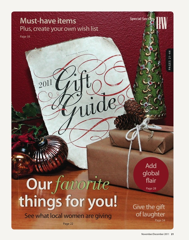
I created the "2011 Gift Guide" paper using tea to give it an aged effect, and then by rolling it and printing on it. By applying the tea effect first, it gave the image an aged effect when I printed it on the paper.
|
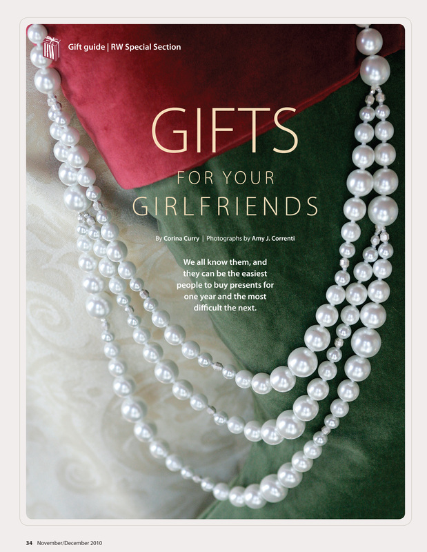
If you've ever had to photograph long necklaces without a model, you know the challenges we faced. This was one of my favorite solutions we came up with for jewelry. Simple and it says "holidays."
|
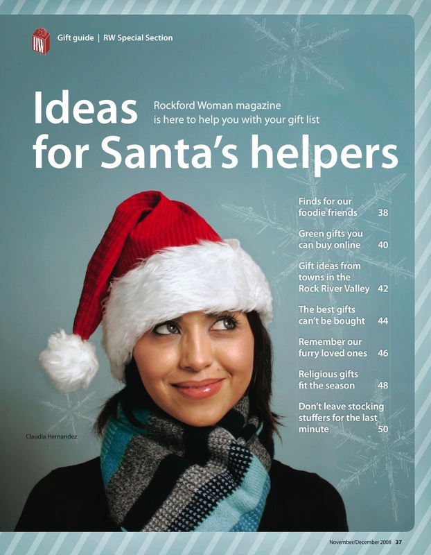
This was the November/December 2008 Gift Guide cover. This is a contrast to my later Gift Guide covers. It's simple and modern. I really like both styles though, I think they work in different ways.
|
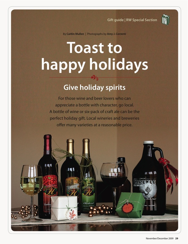
This was a layout from our November/December 2009 Gift Guide. We actually shot this in the dining room of my home. We have gorgeous light in the afternoon, and the photographer and I took advantage of that feature. I created the tags for the gifts and styled the photograph.
|
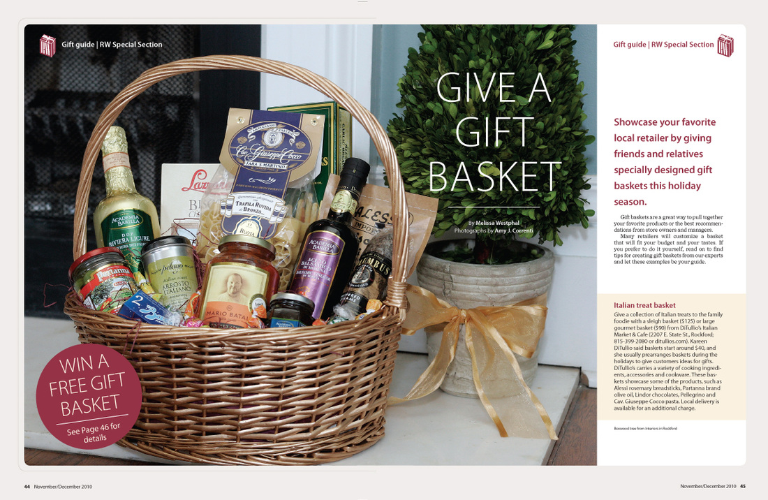
This was a spread I designed for the November/December 2010 Gift Guide.
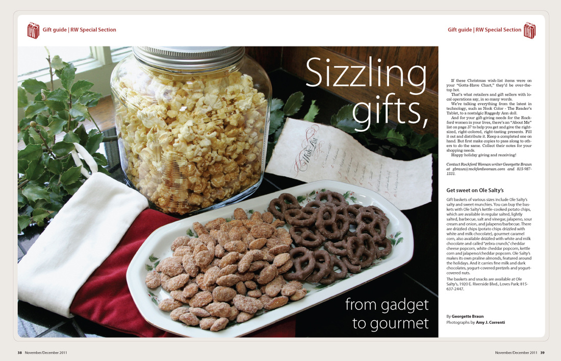
This was a spread I designed for the November/December 2011 Gift Guide. I made the wish list in the photo, which is designed to go with the paper on the cover of the Gift Guide.
|
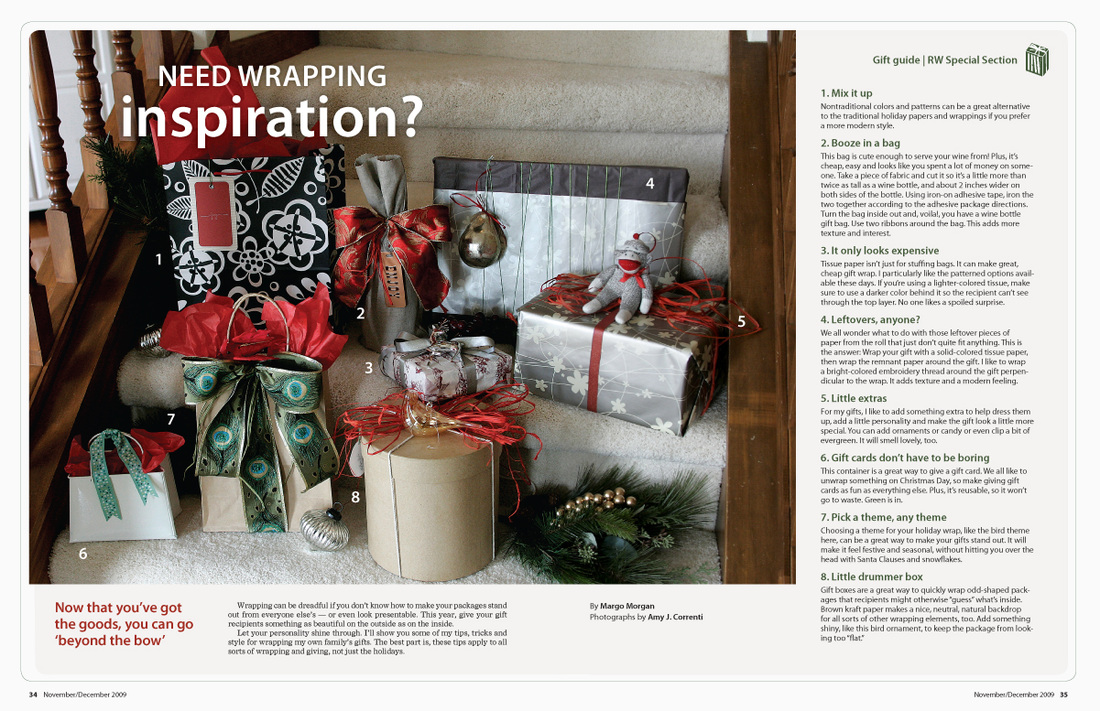
This is an article I wrote in the Rockford Woman magazine 2009 Gift Guide about gift wrapping. I did all the production and styling, and designed the layout.
|
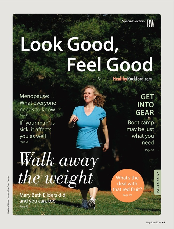
This was a cover for a special section in Rockford Woman magazine called "Look Good, Feel Good."
|
P H O T O S T Y L I N G
As design and art director of Rockford Woman magazine, I helped style photo shoots. Whenever possible, the photographer, Amy J. Correnti, and I tried to use found objects in the space we were working in. This gives the detail photographs more of an authentic look and feel.
|
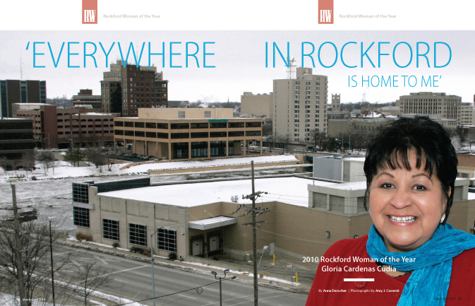
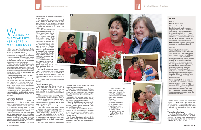
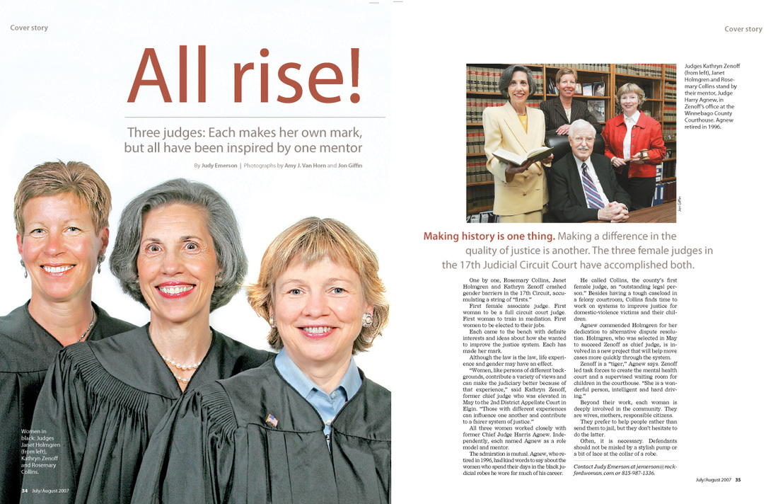
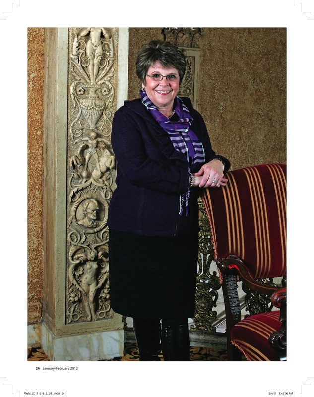
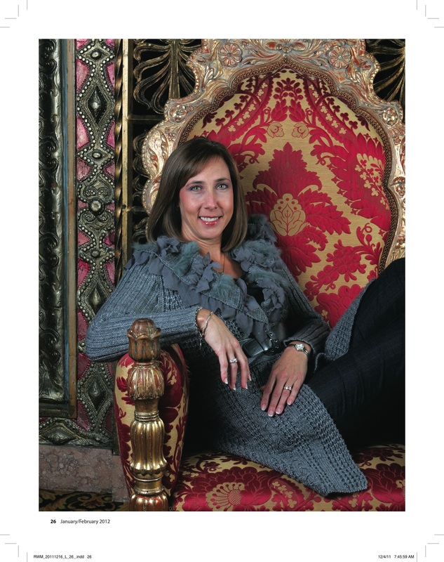
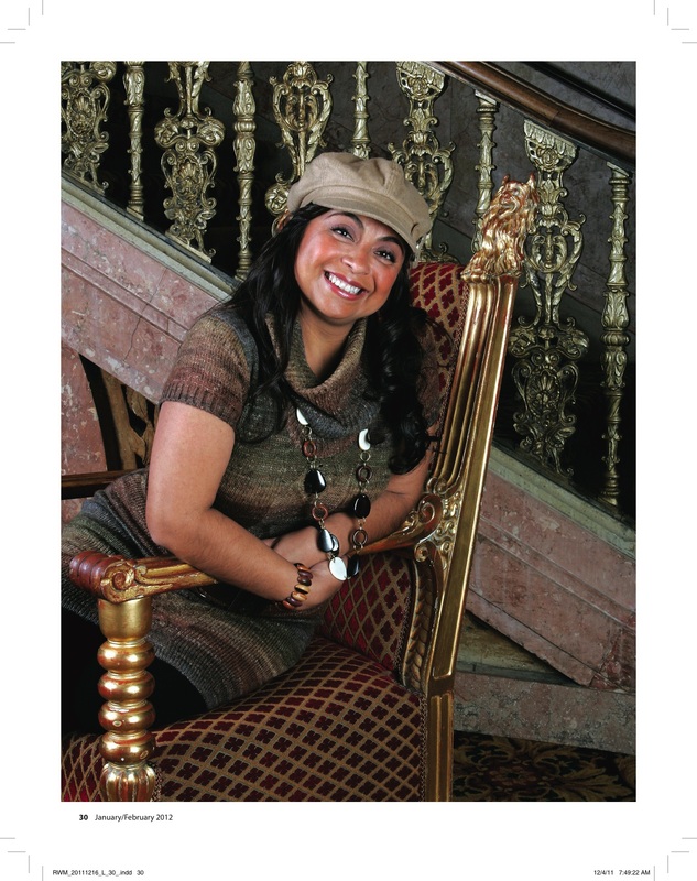
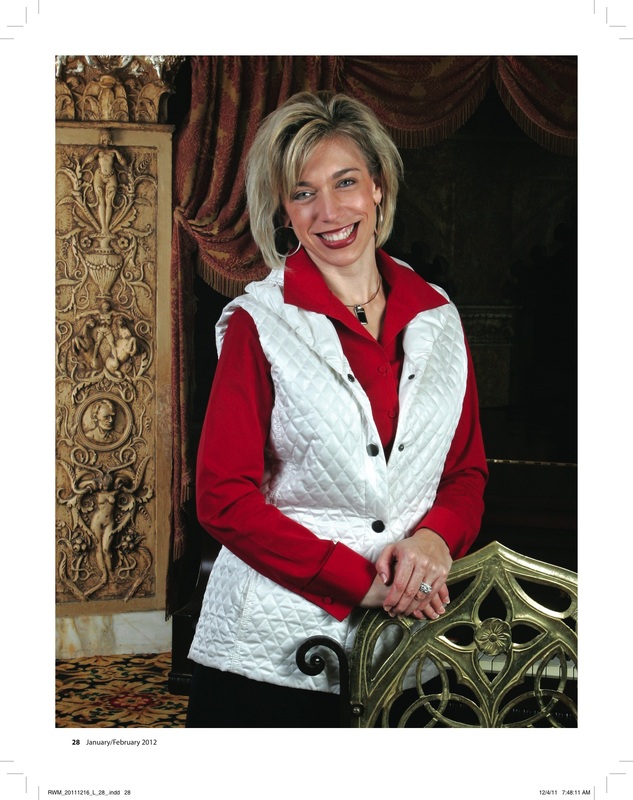
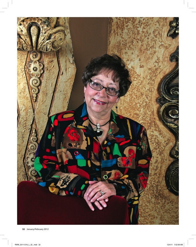
These photographs were all part of our Rockford Woman of the Year 2012 story.
Amy J. Correnti and I worked together to choose the locations for each portrait, and we worked together on the overall cover spread. 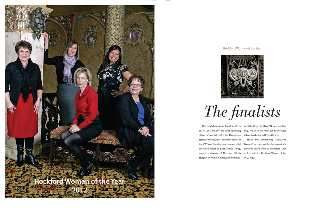
|
|
m3 is a site by margo m. morgan. |
© m3 | margo m. morgan and © Rockford Register Star

