
I N F O G R A P H I C S
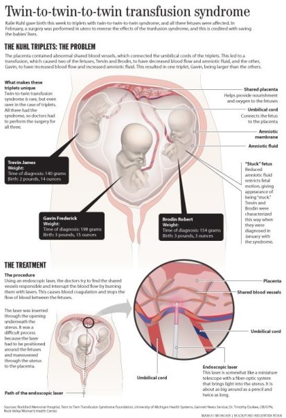
This is a graphic that explains what twin-to-twin-to-twin transfusion syndrome is, and how a local couple's babies were progressing. I attended press conferences, did research in medical textbooks, and illustrated the graphic myself, using provided photos of a fetus.
|
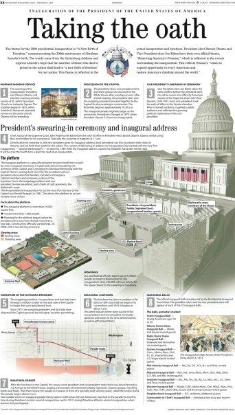
This is a graphic designed by myself and Chris Soprych. It was part of a special commemorative inauguration section for the Rockford Register Star and other GateHouse Media newspapers. Plans for the platform weren't available, so I relied on Flickr and other White House press photography to figure out what it looked like and how it was constructed. I built the platform in Strata 3D. The White House portion was a Strata model. We combined the two to create the image.
|

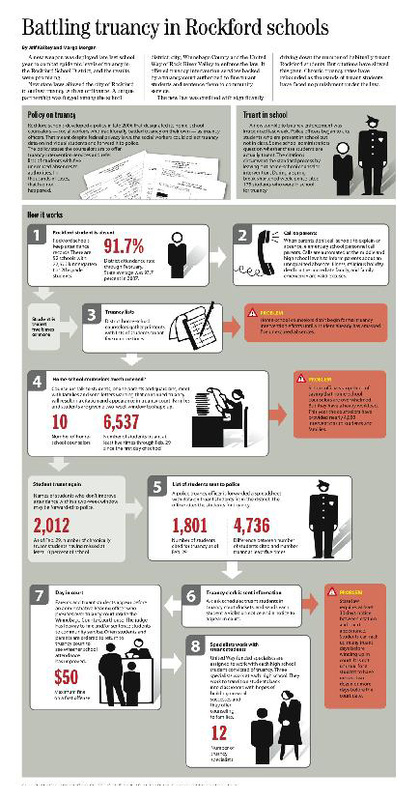
This was one of the first infographics I did when I started at the Rockford Register Star. It still inspires me today, because it combines all the things I love about infographics. Not just looking at them, but creating them. It takes problem solving, research, and it involves creating 3D graphics. All things I love.
|
I love simple graphics like these. As easy and clean as they look, these demonstrate the ability of a designer to organize information into something that's clear and informative to readers.
|
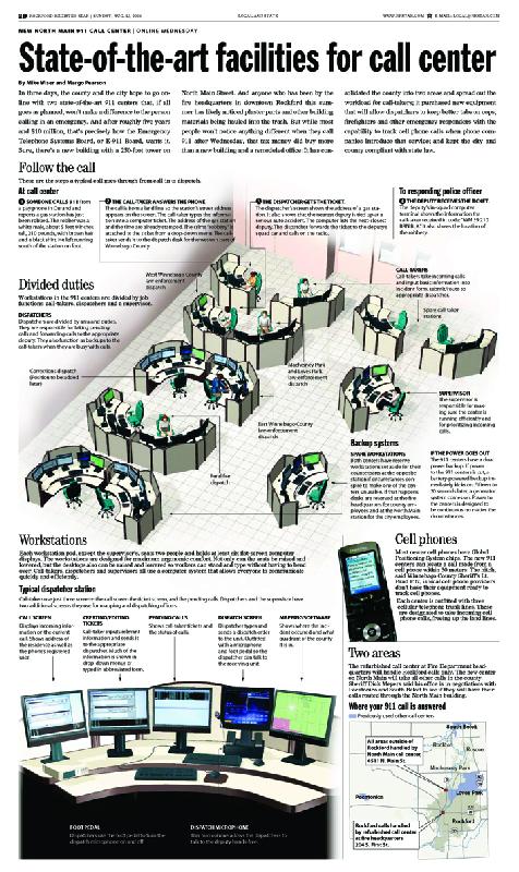
This call center graphic was the first 3D graphic I did almost completely on my own, from start to finish. I researched the graphic, visited the call center before it opened, created the 3D desks and layout, and helped assemble the page. Chris Soprych, my editor, designed and rendered the detail of the desk and computer monitors.
|
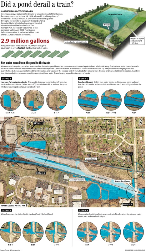
This was a graphic that Chris Soprych and I worked closely together on. It shows the results of an NTSB investigation of the flooding and subsequent train derailment accident in Rockford, Ill. I put together the lower portion of the graphic and Chris designed and rendered the top portion, showing the pond.
|
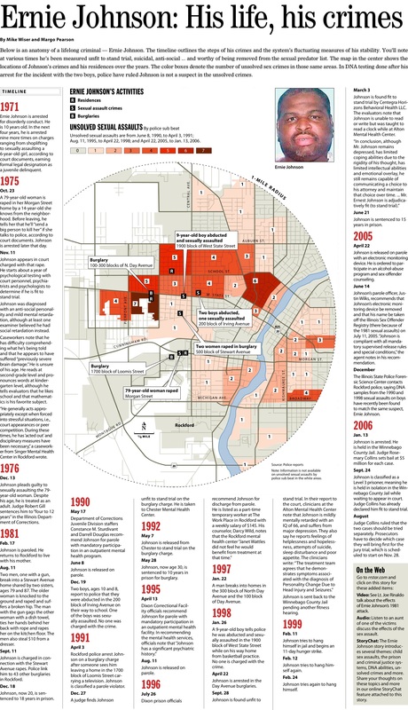
This was a graphic and page design about Ernie Johnson, a lifelong criminal in Rockford. The timeline outlines the steps of his crimes and the system's fluctuating measures of his stability. A former colleague, Mike Wiser, and I put this graphic and page together. The circle represented the 1-mile radius we chose to focus on in examining unsolved sexual assaults within Ernie Johnson's crimes and residences.
|
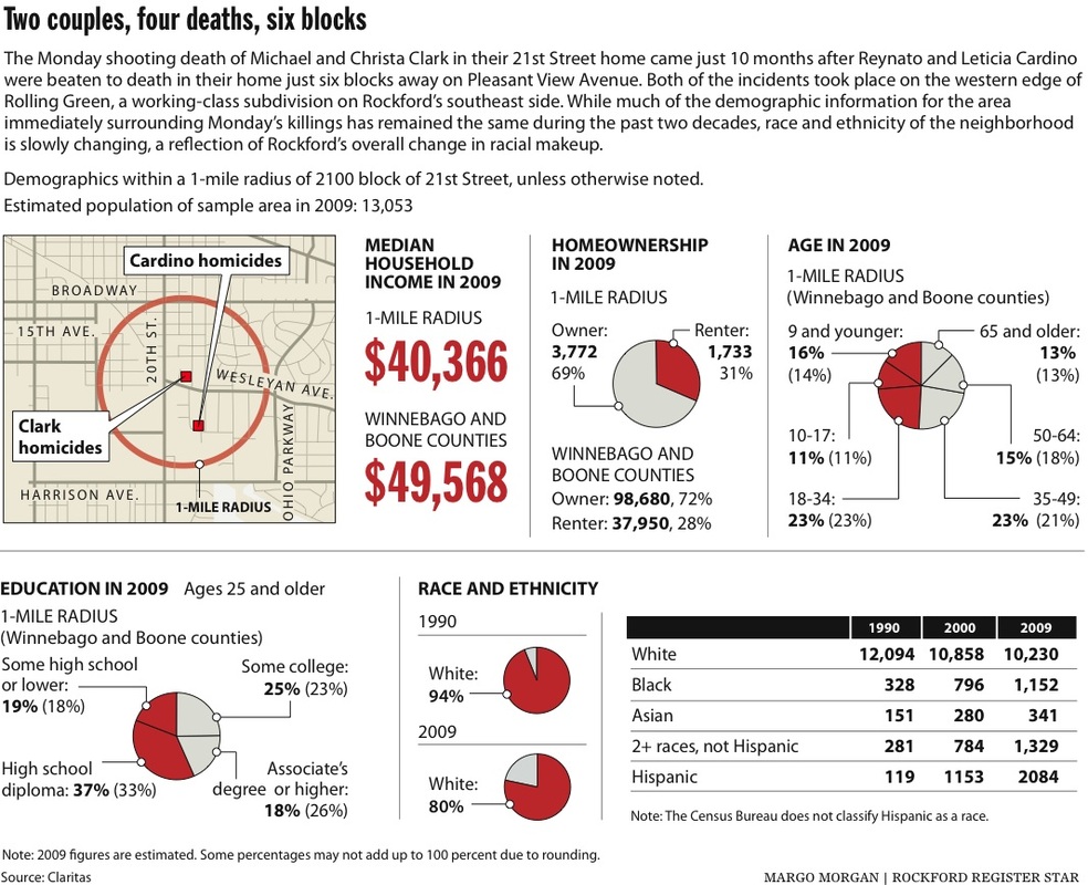
This was a graphic I put together using census demographic information provided by our circulation department's data expert. It shows various demographics for an 1-mile radius area of where two very close, but unrelated crimes occurred. Isaac Guerrero, a local news editor at the time, and I worked together to compile this graphic.
|
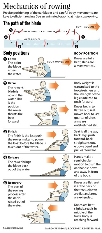
This was a simple graphic I put together to go with a story about Rockford's Regatta. We also produced a quick interactive graphic, showing an animation of the rower.
|
P A G E D E S I G N A N D I L L U S T R A T I O N
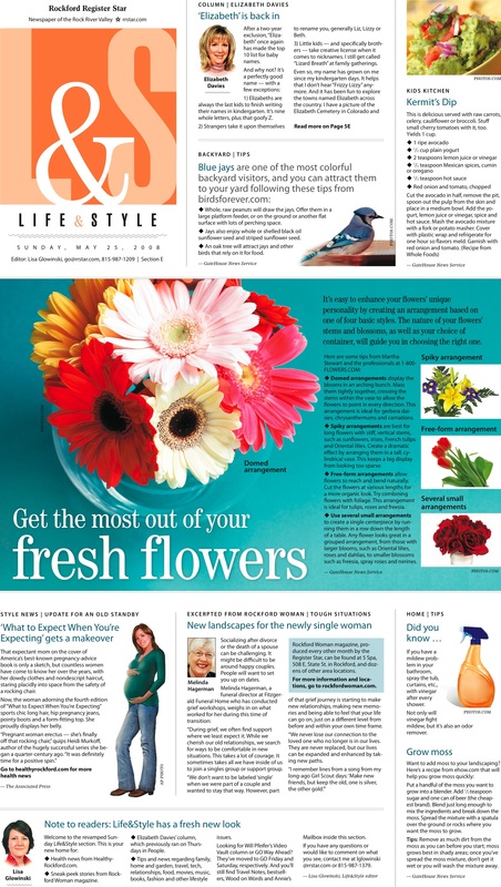
In 2008 I worked with editors to concept and redesign the Life&Style Section of the Register Star. Chris Soprych created the logo to coordinate with the rest of the newspaper's design that he created, and I worked with Chris and other content editors to create the rest of the look and feel for the page. This, along with the magazine, was one of my favorite portions of the newspaper for many years and I was particularly sad to see the design of this page go when the newspaper was redesigned in 2012.
|
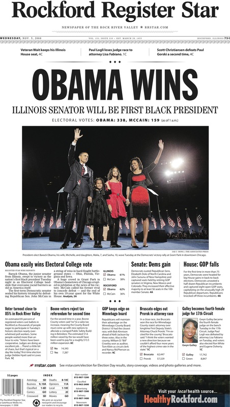
The Register Star's Election cover. This was a group effort, and I worked closely with the News Desk Editor and Linda Grist Cunningham, the executive editor, on this page.
|
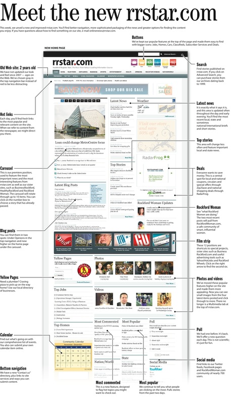
This is a alternative story presentation that my former boss, Chris Soprych, and I put together when the Register Star debuted it's most current website design.
|
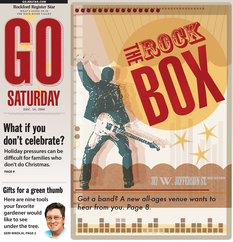
This was an illustrated cover I did for the Rockford Register Star's GO section. It was inspired by music posters.
|
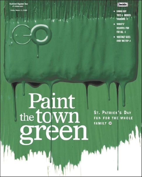
This was the cover for the Rockford Register Star's entertainment section. It was about St. Patrick's Day events. The photographer and I collaborated on the cover.
|
This was an illustration I designed for a features cover. I love the style of vintage posters and the inspiration they offer. I particularly love how the "GO" logo was incorporated into this cover.
|
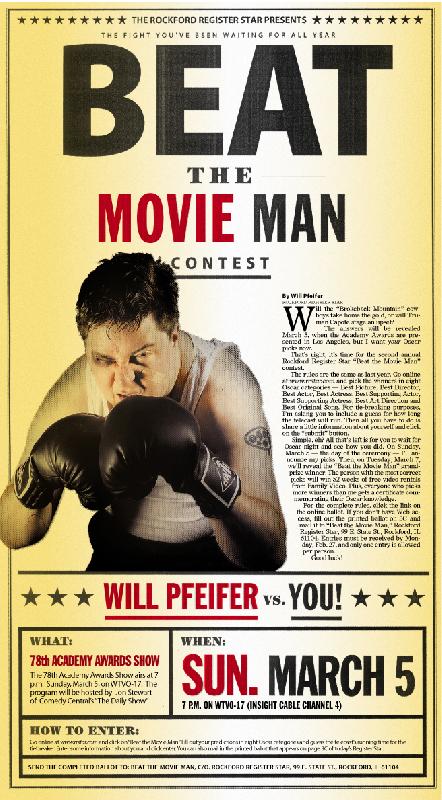
This is the first in a series of "Beat the Movie Man" posters I designed for the Register Star's annual Movie Man contest. Notice the degradations in the word "Beat." I designed the large type on the page, then printed it, copied it and scanned it to achieve the effect.
|
This is the second in a series of "Beat The Movie Man" posters I designed for the Register Star's annual Movie Man contest. One of my favorite elements of this design is the subtle lines that overlay Will Pfeifer's face. They really help make his face look authentic within the poster.
|
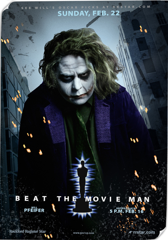
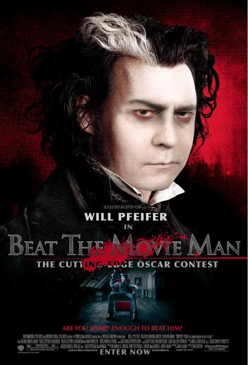
This is the third in a series of "Beat The Movie Man" posters. We made Will Pfeifer look like the "Joker" in this version. The detail to notice in this poster is that the news tower and the press bulding are actually in the background.
|
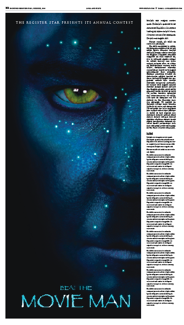
This is the fourth in a series of "Beat The Movie Man" posters. We made Will Pfeifer look like an "Avatar." To create this look, I painted Will's face in blue makeup, we photoraphed him and then I photoshopped the rest to look like the movie poster.
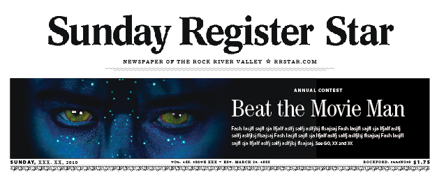
The page one teaser to the full page poster inside
|
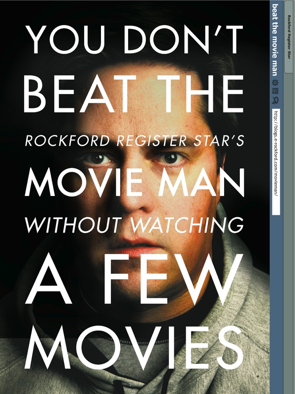
This is the last in a series of "Beat The Movie Man" posters. We took a relatively simple concept and approach this time, but we were careful to make sure we chose appropriate apparel and the lighting and photography were carefully examined by my husband before shooting the photo. The most challenging portion of the cover was making sure that the typography stayed true tot he cover in how it was placed and executed.
|
R E G I S T E R S T A R M E D I A B O O K S
The Rockford Register Star has created numerous books over the years. I had the opportunity to help design some of them.
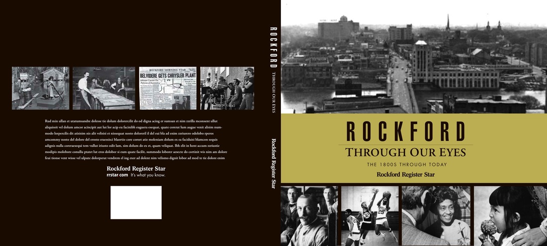
This is the "Rockford Through Our Eyes" book that the Rockford Register Star created, in conjunction with Piedmont Books. I had the opportunity to design the cover wrap. The back cover text was placed later.
|
I also had the opportunity work on a series we called "Voices of History." This was a series that told the stories of notable people in the community, all older, with interesting and intriguing lives. After the series was finished, as a special gift and thank you to the participants and their families, we created keepsake books for each person featured. We used the stories and the photos and I designed and had each printed. This was a rewarding and fun project to work on. To view an example of the book, click here >
|
|
m3 is a site by margo m. morgan. |
© m3 | margo m. morgan and © Rockford Register Star

